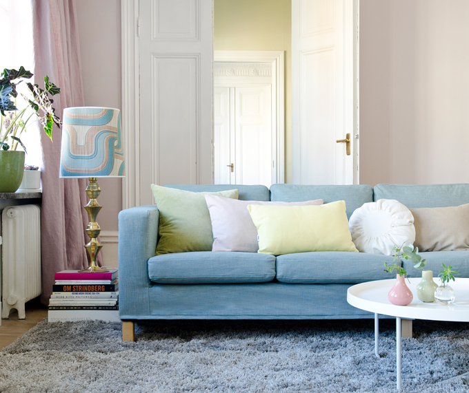
After years of wondering at the hoopla surrounding the unveiling of the Pantone Color of the Year and then seeing it EVERYWHERE, I’m breaking down this year and diving in to research and learn how to use it well. Or I was, anyway.
Until I saw the 2016 Pantone Color(s) of the Year.
This year they’ve decided to do a pairing. Something sweet (like a toothache) and soft (like Easter or a almost-healed bruise). I thought my ‘EWW’ reaction was just me, but it looks like designers across the board are quietly suggesting that we just wait for next year’s color or ‘use it as an accent only’ or ‘pick one of the two’.
If you’re sold on trying to update your decor this year, here are the few great design blogs who have found some inspirations that seem feasible without looking like Gramma’s pastel floral curtains. Click each photo to check the blogs.
(in the meantime, from your Realtors perspective… no pink walls! 😉
– Dee
French By Design Blog

